
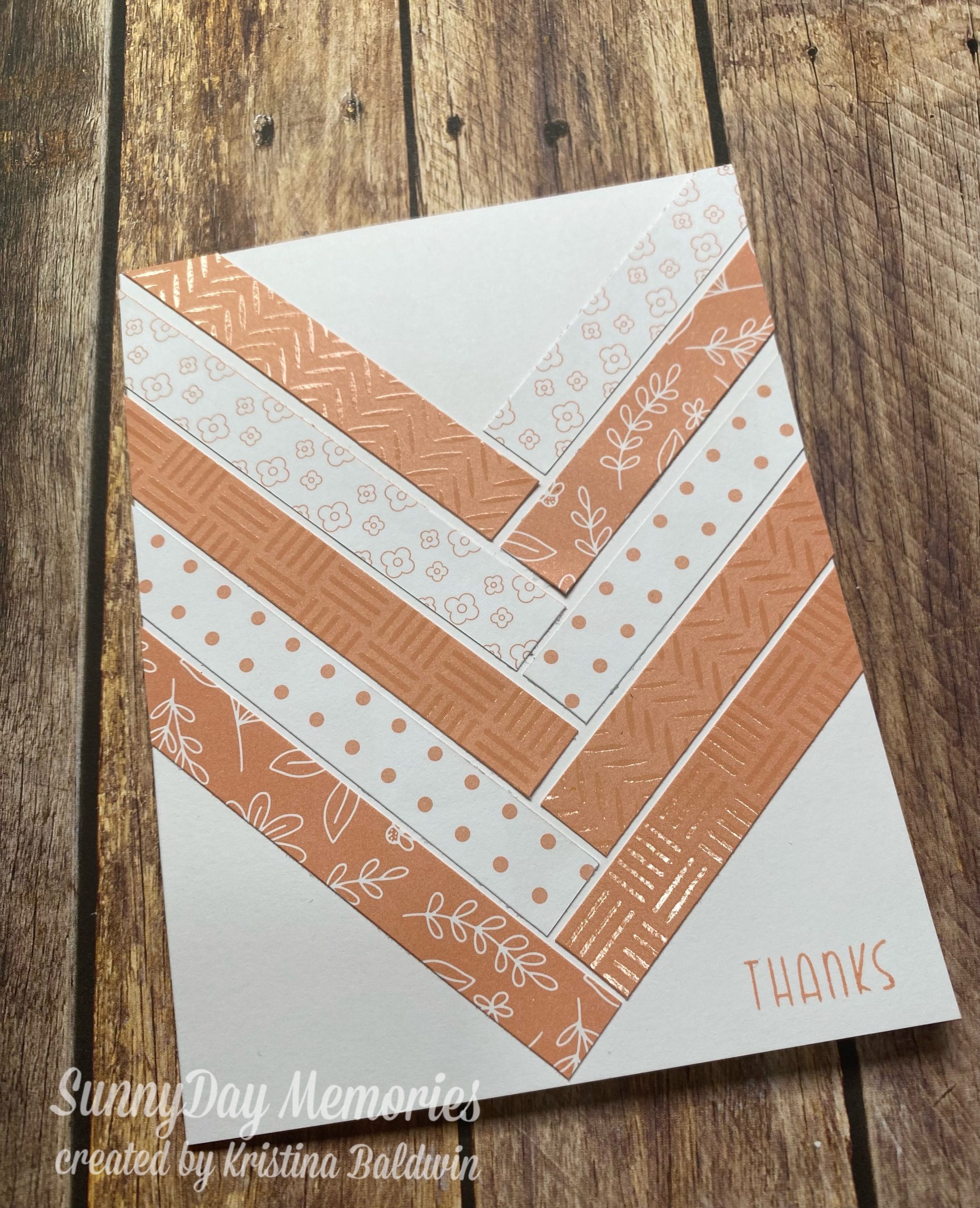

Today I have a simple Melon Mania Card that showcases many of the beautiful patterns in this special collection. It’s also a fabulous design for using up your scraps! If you haven’t looked at our Color of the Year–Melon–you definitely should!
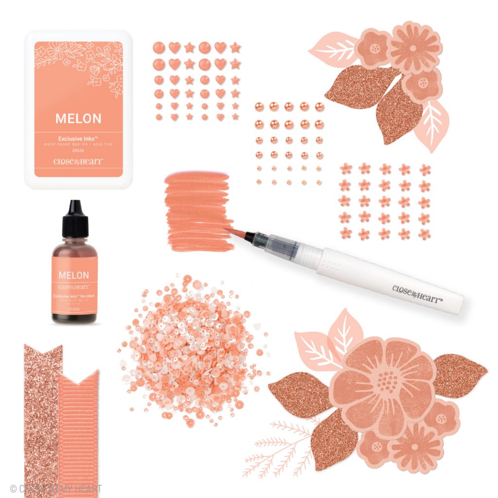
During the Melon Mania Special, you can save on our fabulous Melon products PLUS you’ll also find some great new exclusive Melon products, too.
In case you missed it, Close To My Heart recently shared a blog post that not only discussed this wonderful special, but also dived a little into color theory, too. Since knowledge is power (and the artwork is super inspiring!), I’m sharing the post with you here.
If you haven’t been introduced to our color of the year, this is the perfect time to do so! Meet Melon! A dreamy, orange hue that we simply can’t get enough of!
In just a couple of months, this gorgeous color will be retiring and replaced with a new color for the following year. To give it the proper sendoff it deserves, we are celebrating Melon with an exciting collection of new exclusive products and limited time discounts on existing Melon items. Make sure to check out the Melon Mania on our website so you don’t miss out!
We’ve talked about color theory quite a few times on this blog before, and today we’ll touch on it again to show you where Melon fits in the mix.
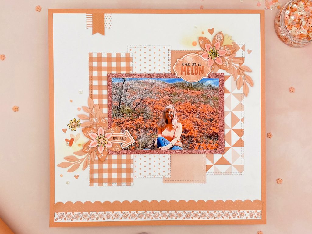
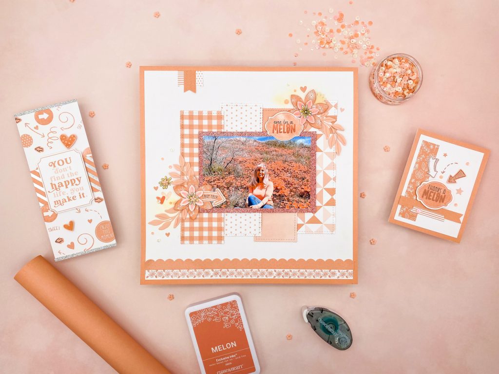
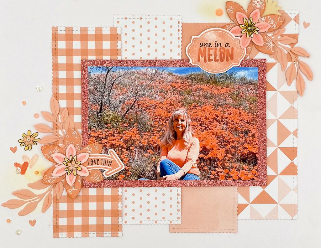
The layout above is saturated in Melon, as you probably figured. If you look closely, (or maybe use the recipe of all the products we used, listed at the end, as a cheat 😉) you will see that we added a bit of a similar, yet slightly darker color, Desert Rose. The glitter paper mat that the photo rests on is Desert Rose and so is the bottom half of the stamped “MELON” in “one in a MELON.” A third color that you’ll find is that orangy-yellow Shortbread shadow that we sponged behind the two floral clusters on the page.
A lot of us know, or at least think we know, what a monochromatic color scheme is. Monochromatic color designs make use of a single color that varies in lightness and saturation. This type of color “combination,” if you will, is easy to achieve with some of our favorite Close To My Heart products. Take our two-toned Melon cardstock, for example. We have Melon on one side and light Melon on the other. Because they are two tones of the same color, when used together they are considered monochromatic. Second generation stamping, where you stamp an image a second time without applying more ink to get a lighter image, is another way to play with monochromatic colors in your art.
Sometimes, a piece of artwork that we may think is monochromatic is actually following an analogous scheme, which is just a fancy way of saying that the featured colors are next to each other on the color wheel. One color is typically dominant while neighboring colors are used to enhance the design. In our example layout above, we make use of both monochromatic and analogous colors.
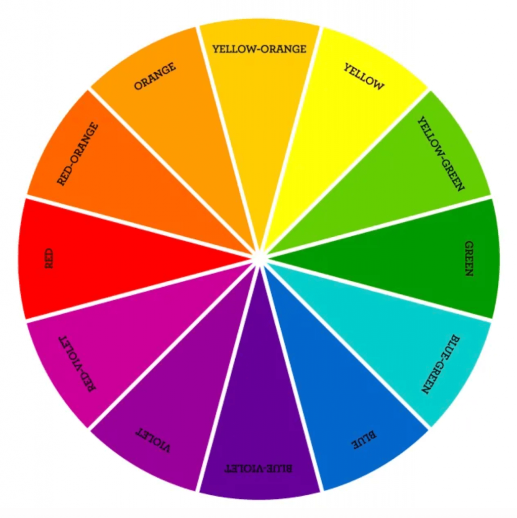
If we look at the color wheel, the three colors we used to make our layout, Melon, Desert Rose, and Shortbread (or roughly red-orange, orange, and yellow-orange) are adjacent to each other.
The right color combinations can also assist in creating or amplifying dimension.
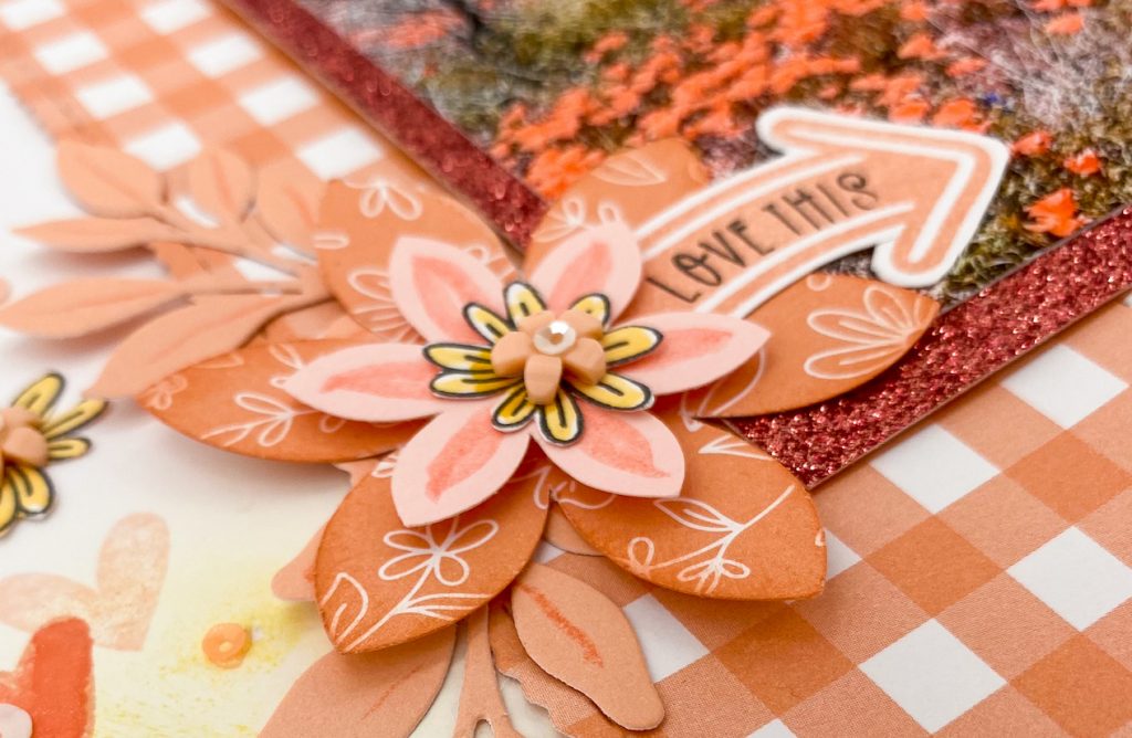
We already mentioned the sponged Shortbread ink color behind the floral clusters in our layout. Still keeping to our monochromatic and analogous theme, we used the Melon shimmer brush to draw leaf stems on light Melon cardstock and Desert rose ink to sponge the edges of the large, bottom flower. Both clusters were topped with a hand trimmed, stamped flower that was colored with Shortbread ink. The colors in these clusters were organized like a sandwich. With Shortbread only at the base and very top, your mind subconsciously notices all of the layers in between.
Complementary colors are two colors opposite each other on the color wheel, such as orange and blue, or red-orange and blue-green. If you notice, one side of the color wheel is made up of warm colors while the other is made up of cool colors. Complementary colors, since they are across from one another, will have one of each. They create a vibrant contrast, making each other pop without being jarring to the eye.
In our gorgeous Melon layout, can you spot the complementary color?
The blue sky in the photo! When choosing colors for your artwork, don’t forget to consider the colors in the photo you are wanting to scrapbook. Go to the color wheel and pick a dominant color, then look at the colors around it. Make use of these colors with your papers, inks, and embellishments and you can’t go wrong!
One final element to note in this scrapbook page is the use of lines. While our patterned paper may not be striped, let’s consider the lines created by the paper shapes themselves. Lines in art can be vertical, horizontal, or diagonal, straight, or curved, thick or thin, and they lead your eye around the artwork.
The lines in this page all point our attention to the center, where the photo rests. It’s important to note that the lines in the background, created by the four rectangular patterned papers, were placed vertically because the photo is horizontal. If the photo in the center were vertical, then we’d want the background papers to be horizontal. This is because the cross section is where all of the line pointing ends. To put it simply, X marks the spot.
This is what the pointing and cross-sectioning can look like in cards.
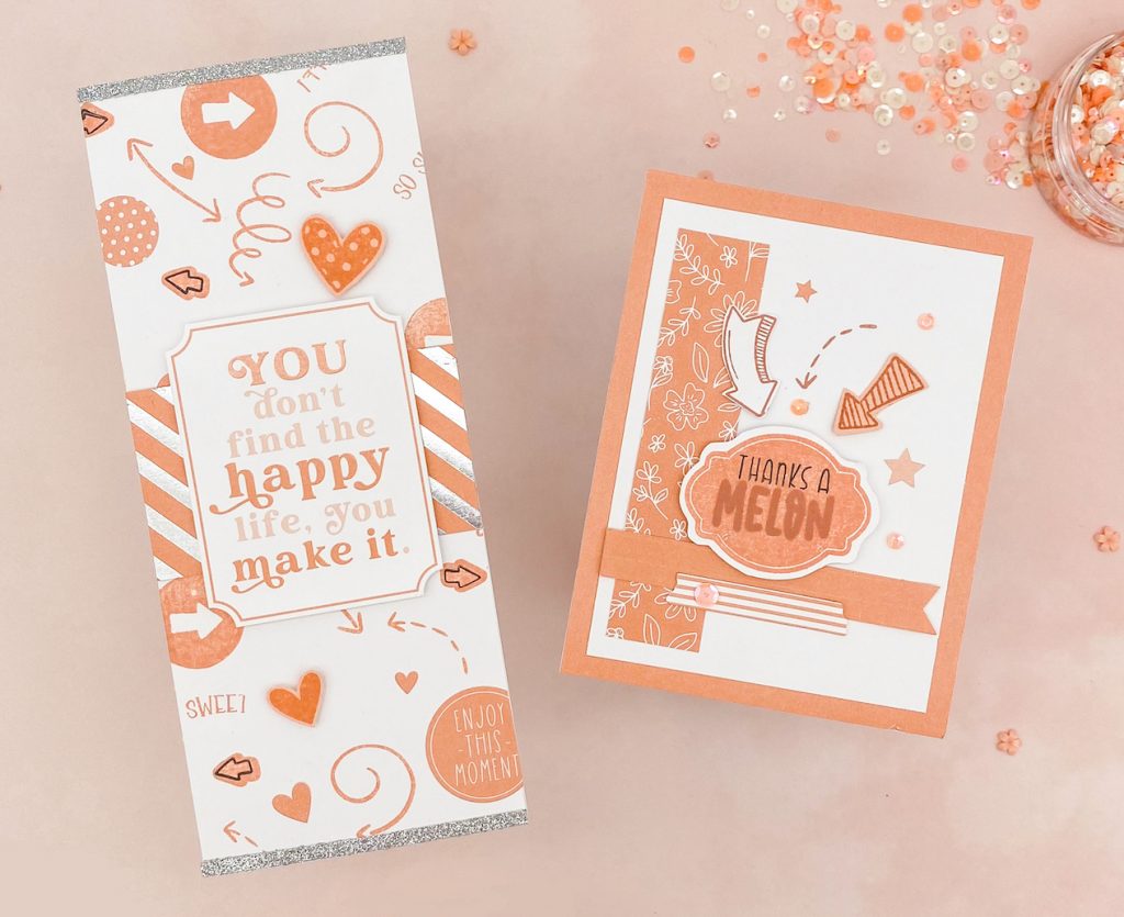
We are visually communicating to zero in on the sentiments. Not only do these lines provide a place for our eyes to land and rest, but they also create a visual anchor for the sentiments, so they don’t appear to be floating on an empty space.
The ideas that we discussed in this post are what really matter—not the technical names or reasons why they do work. The end goal is to know how to, time and time again, choose colors and designs that will work well together as you create art worthy of preserving your memories and celebrating your relationships.
Hopefully you gained a little more understanding on what makes colors work well together. And how to tie a design together for maximum “wow” factor. Melon is such a lovely color. In many ways it almost acts as a neutral because it pairs nicely with colors you might not think to put together. Following these tips, you should have no trouble creating your own simple Melon Mania Card.